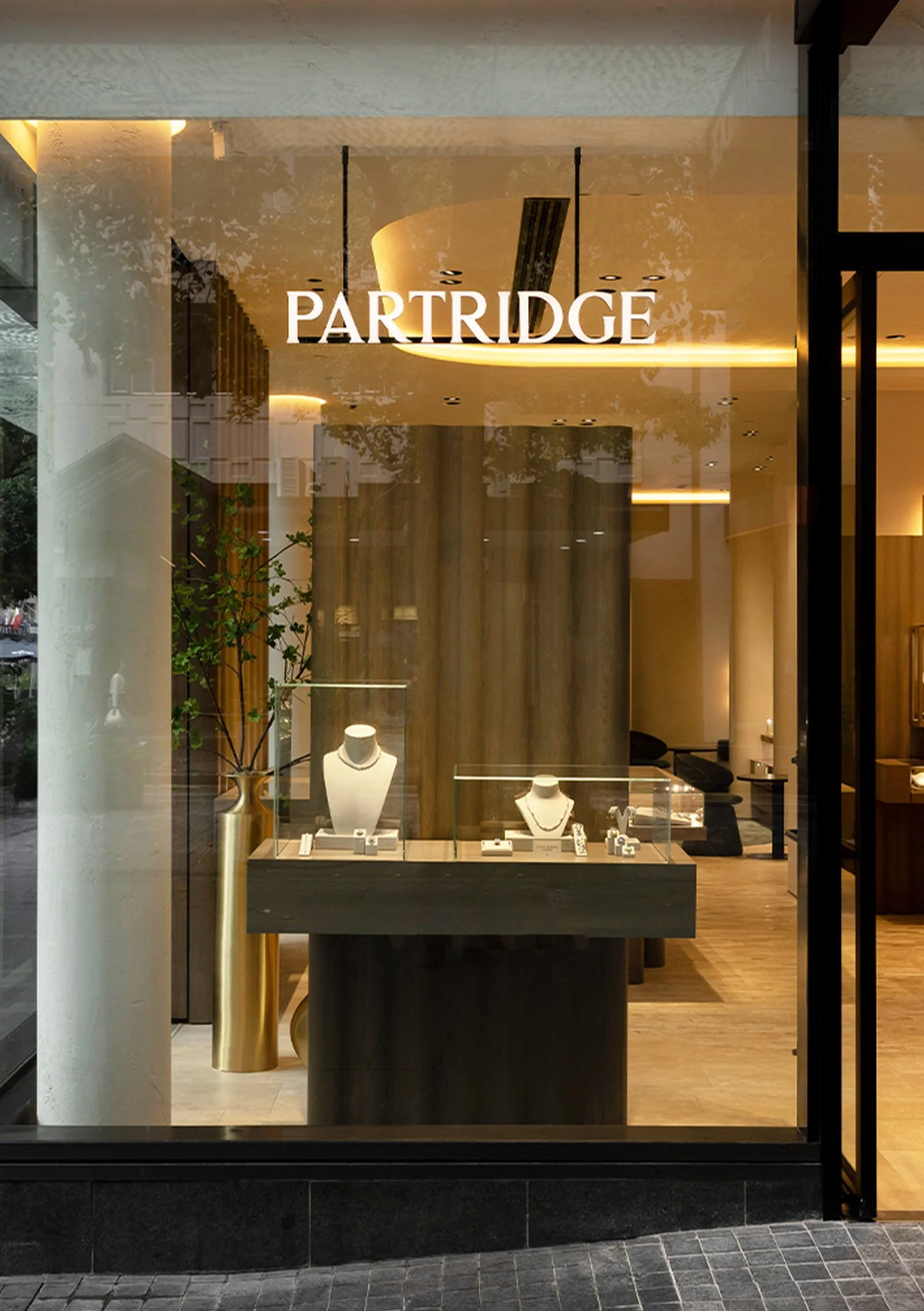
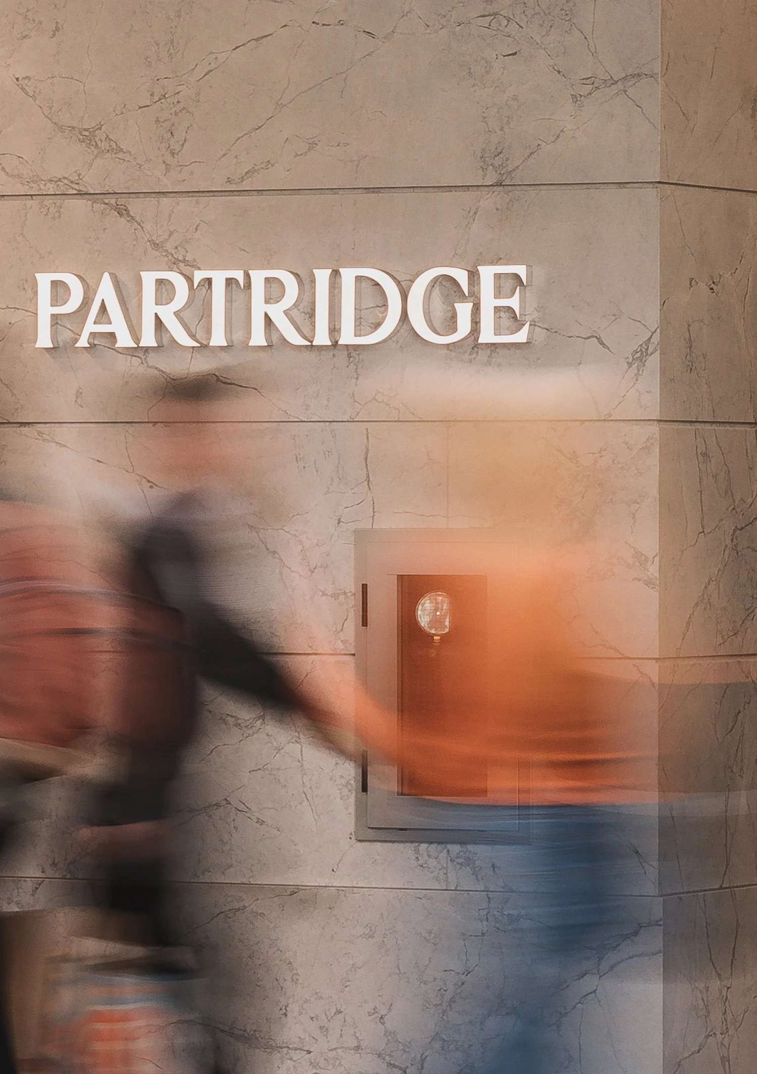
partridge – BRAND IDENTITY
In the late 1800s, James Partridge set sail from England to New Zealand, taking great risk. It was in the small town of Timaru that he established his new store, beginning a six-generation-long legacy that would come to be synonymous with excellence in the craft of jewellery making.
Celebrating 160 years in 2024, Partridge has established a reputation as New Zealand’s trusted source for the world’s most desirable watch and jewellery brands. We were delighted to have been asked by Grant Partridge and his team to create a new visual identity and advertising campaign for this anniversary year.
Reflecting on this legacy, the identity was inspired by the journey of James Partridge. Through considered spacing, organic serifs and elegant typographic strokes, the wordmark and monogram encapsulate both his daring confidence and dedication to craftsmanship. To accompany the identity, a new tagline emerged; Above Us Only Sky. This new line reflects on The Long White Cloud; a name given to New Zealand when Maori navigators first explored this new land, witnessing a cloud spreading across the horizon.
The previous monogram had elaborate decorative elements. To convey a more confident and trusted brand, our solution was to simplify the lettering while retaining a sense of elegance. The diamond decoration was moved to create a punctuation-mark to better represent Partridge as the trusted source for the world’s most desirable watch and jewellery brands, while respecting the recognisable features of the previous identity.
As part of the brand lexicon, the Partridge mascot became a symbol of prosperity, family and belonging. This symbol plays an important role in establishing a new narrative for the brand, imagining the emigration of James Partridge.
We collaborated with illustrator, Lorena G to create this bespoke mascot.


